Wednesday, March 19, 2008
Friday, March 14, 2008
I. Preproduction- Background Design
 Backgrounds are very important as well, they help create the mood and add to the overall look and feel of your animated short.
Upper left & upper right: "I am the Superhero"
I wanted a comic book/collage feel, so my sister Carmen made amazing backgrounds from buildings, gave them a tint and added a color tone filter in Photoshop to create the moire effect seen in most comics.
For the action scenes in this short I also wanted some action lines, also inspired from comics.
Lower left: "Putek"
Me and co director Tey Clamor was going for a darker tone to this short, yet still retain the cartoony distorted feel. She did a great job using dark blue hues and offsetting them with the yellow light from windows.
Lower right: "The Jerk"
I wanted a looser feel to this one, gave the backgrounds a rough colored edge, which I think came out really well.
For stories that involve the character traveling across a large area, a map may be drawn as a guide for using certain backgrounds in a scene. Here, I placed numbers regarding the areas where "Anna" will pass chronologically according to the "Libingan" script.
Why is this necessary? because when you start drawing your backgrounds, you will know which elements will remain, disappear, or appear depending on the angle you choose for your shot!
*It is important to note that the art direction of a film covers a color palette, drawing style, animation movement style of all the elements. Once these are all carefully blended together, the film has a more cohesive, solid look.
happy backgrounding!
next: Storyboards!
Tuesday, March 4, 2008
"The Jerk" is now in Atomfilms!

The Jerk, a short made within 48 hours (not by choice) was accepted into atomfilms! You can have a look here.
How it was made info to follow soon!
Wednesday, February 20, 2008
I. Preproduction- Character Designs
C. Character
Once the script and story is done, characters and locations of the story can be visualized by the concept artist depending on the characteristics of each character, the mood of a location, and the director's (that's you!) vision of how each element in the story should look like.
 ROUGH sketches and gestures for my first film "EGG"
these poses need work! wahahaha... oh well... we're all learning.
 Turnarounds for Mr Mani, of "I am the Superhero".
If you notice, I also added some style guides on how hands, eyes, noses should look in this short film too, that way other artists designing other characters for the same film will look like they belong in the same film!
A character comparison is also good to see the proportions of one character with the other!
Once I have more than one character, I get their front views and place them side by side, to check how each of them compares with each other in terms of proportions and size. You may notice the blue circles beside Anna's head, those are about the same size as her head.
When designing characters and making a size comparison, or size comp, I like to measure them by heads than by actual units of measurement. (I wasn't too good in physics and science after grade school!)
next: backgrounds!
in the meantime, check out these amazing character artists and site:
Arthur de Pins
Francisco Herrera
Alberto Ruiz
Character Design blogspot
Tuesday, February 12, 2008
I. Preproduction- Sequence Outline & Script
I. Preproduction
Animation requires a lot of planning. Although it may seem tedious and time consuming at first, careful planning and setting up of a story will save you a lot of time in the long run. This is the most important process, and usually takes the longest.
Before you want to start doing the visuals, you might want to pick your brain and write your story down so you can "free up more space" for the visuals in your mind that will happen later on (it works for me!). Remember, this is also important too!
Writing a story down will test you to see if you can put a story together on paper! If you can say it through words and the audience will understand it, then you have a bigger chance of making your story be understood in it's final form. This is just the beginning!
Subject.
Think of a concept or a subject. It can be about anything, from a social issue to a moral lesson, to a frustration or simply something that just needs to be said.
Story.
From the subject/concept, wrapping a story around it will be helpful, and entertaining as well. Animated filmmaking is storytelling after all. This is the most important aspect of a film, without it you will have an empty shell no matter how technically superior or eye-catching your animation may be, it will be easily forgotten if it has an awful, cliché, or simply bad story.
A. Sequence Outline
Once you’ve got your story done, you can flesh it out by making a sequence outline. It’s just a chronological list of all the important, general events that happen in the story.
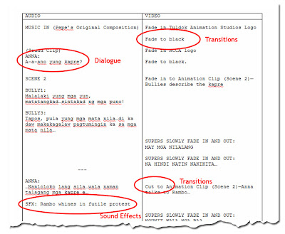
The script is a more detailed version of your sequence outline. Here all the details are placed, even minor actions, dialogue, sound effects cues, and scene transitions to bring your characters and film (almost!) to life.
For animation it is useful to have your script divided into two columns: one for audio (what you hear) and one for video (what you see).
There are quite a lot of sites and books that deal with this in much more detail, google them!
My friend keeps complaining that the columns need to be switched into Video and Audio, personally I do mine like the one above coz I got used to the AV acronym, meaning Audio (first!) then video! but eh... it's up to you. :)
next: Character and background designs!
Saturday, January 26, 2008
Welcome! First of all.. a quick message...
 My fascination of the animated film since childhood has changed into the desire of wanting to create them myself. My inaccessibility to the actual equipment used to create animated stories back then has led me to improvise on certain aspects but still be able to create one nevertheless. I believe problems are challenges and that limitations actually open windows to new, creative and more interesting possibilities.
What I value most above everything else in my stories is the message it carries, and how it is delivered to the audience. I try to not make my messages in-your-face as I highly regard my audience, believing that they can connect the dots for themselves, or if they wish, create their own interpretations of my stories, which usually consist of several levels, and each of which can be seen depending on one’s experiences in life.
Later on I discovered that my country has been one of the main producers of the many cartoons I have grown up with; a bittersweet discovery as one may say as I found out that my country has not been given public credit it has deserved for almost three decades. My country, alongside other third worlds is actually a sweatshop: cheaper labor for producing these films, and is one of the industry’s secrets that it would rather keep quiet about. I have further realized that despite the fact that we have been making animation for others all this time, we have yet to possess an animation identity we can distinctly call our own. It is from here that I have found my path: to create a Filipino animation identity, and help the world recognize it.


